Feature
Psychological Thriller Book Covers
Matt Witten
Last October, after Oceanview Publishing accepted my psychological thriller The Necklace for publication, they asked for my input on a book cover. I was stunned. My novelist friends had warned me that publishers never care in the slightest what authors think about covers.
I spent the next two weeks thinking deeply about book covers. I decided that a good cover does two basic things: It tells you what to expect when you open the book, and it makes you want to open it.
As I tried to imagine a cover for The Necklace, I distilled the novel down to its essence. It’s a fast-paced psychological thriller starring an unlikely heroine: a small-town waitress from upstate New York fighting to get justice for her murdered daughter. She comes to believe the man who’s about to be executed may be innocent, and the real killer may be running free. The plastic beaded necklace that her daughter was wearing when she was murdered becomes an important piece of evidence.
So what should the cover of The Necklace look like? I came up with four key elements:
1) The cover should say “psychological thriller.”
2) It should have some visual about the murdered daughter.
3) There should be something on the cover about the heroic mother.
4) The cover should feature the necklace.
With these principles in hand, I spent two weeks studying covers of similar psychological thrillers. One of my favorites was this:
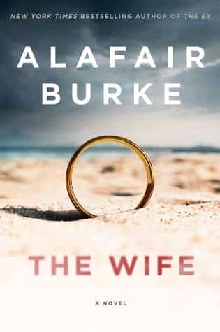
I was intrigued that this cover doesn’t actually have a picture of the wife, only the ring that symbolized her and her marriage. I also found it disturbing, in a good way, that the ring was some place where it clearly didn’t belong. This said to me, subtly: psychological thriller.
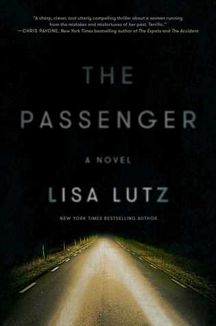
Another cover I loved was this one for The Passenger.
I wanted to know where that road went. I wanted to travel down it into mysterious regions.
I was surprised that once again I was attracted to a cover with no people on it. I’ve always thought a cover should introduce you to the main character. But evidently there are other ways to do that than actually showing her face.

Here is a similar cover, with visuals that are just as arresting as the title.
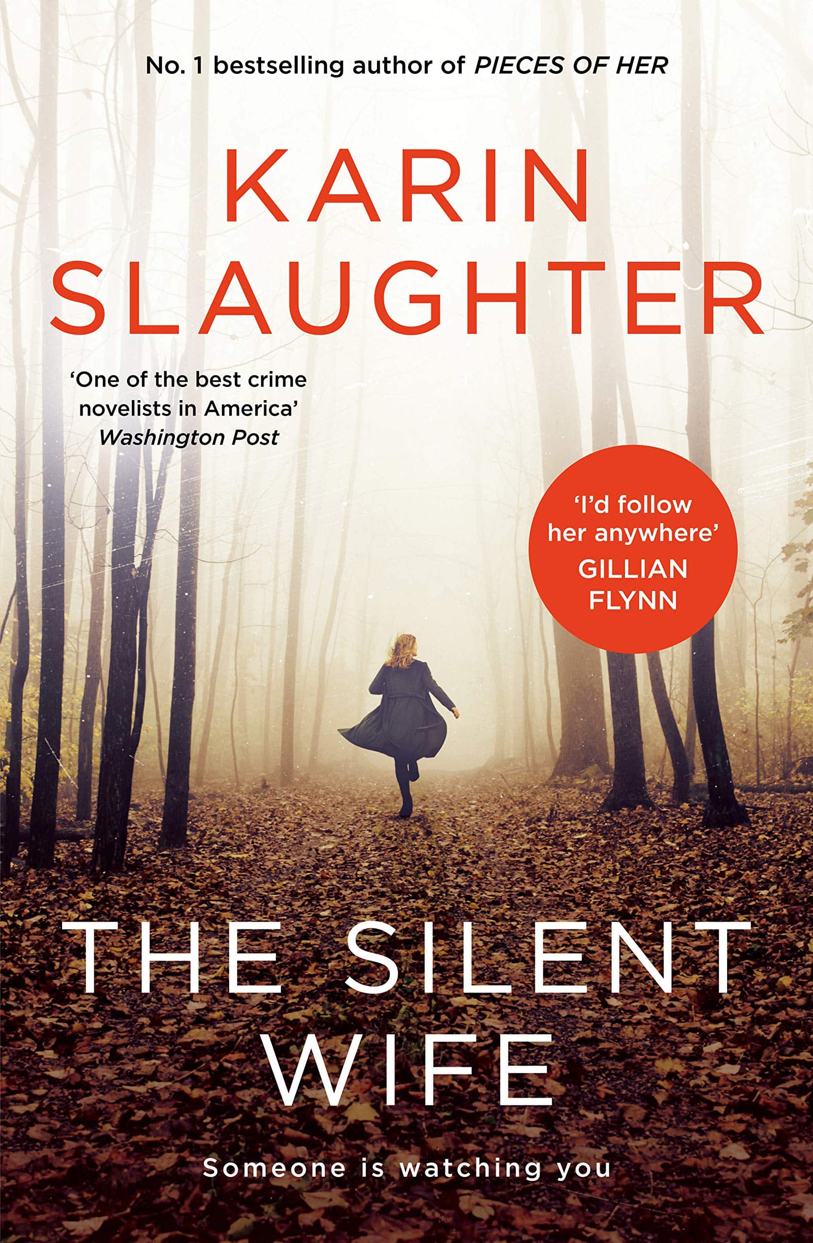
Then I found several thriller covers that had pictures of the main character, like this one. I like this because the main character is active, running. It makes me think the novel has good action.
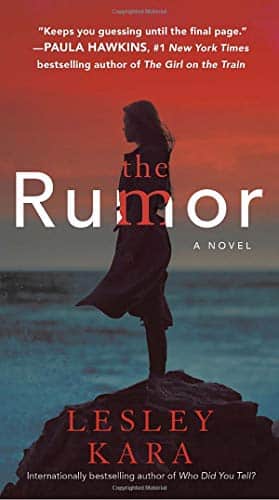
Then there’s this cover, for The Rumor. It’s much more meditative and thoughtful, the kind of novel I’d want to read on a cold winter night in front of the fire.
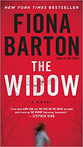
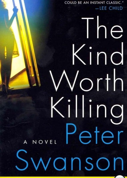
Here are two more with dimly seen women, which adds to the feeling of mystery.
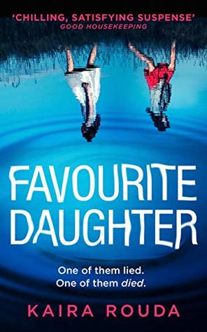
This cover for Favourite Daughter works for me, but I decided something like this would be too supernatural-ish or horror-movie-esque to work for my novel. I didn’t want to fool my reader into thinking they were getting a genre they weren’t getting.
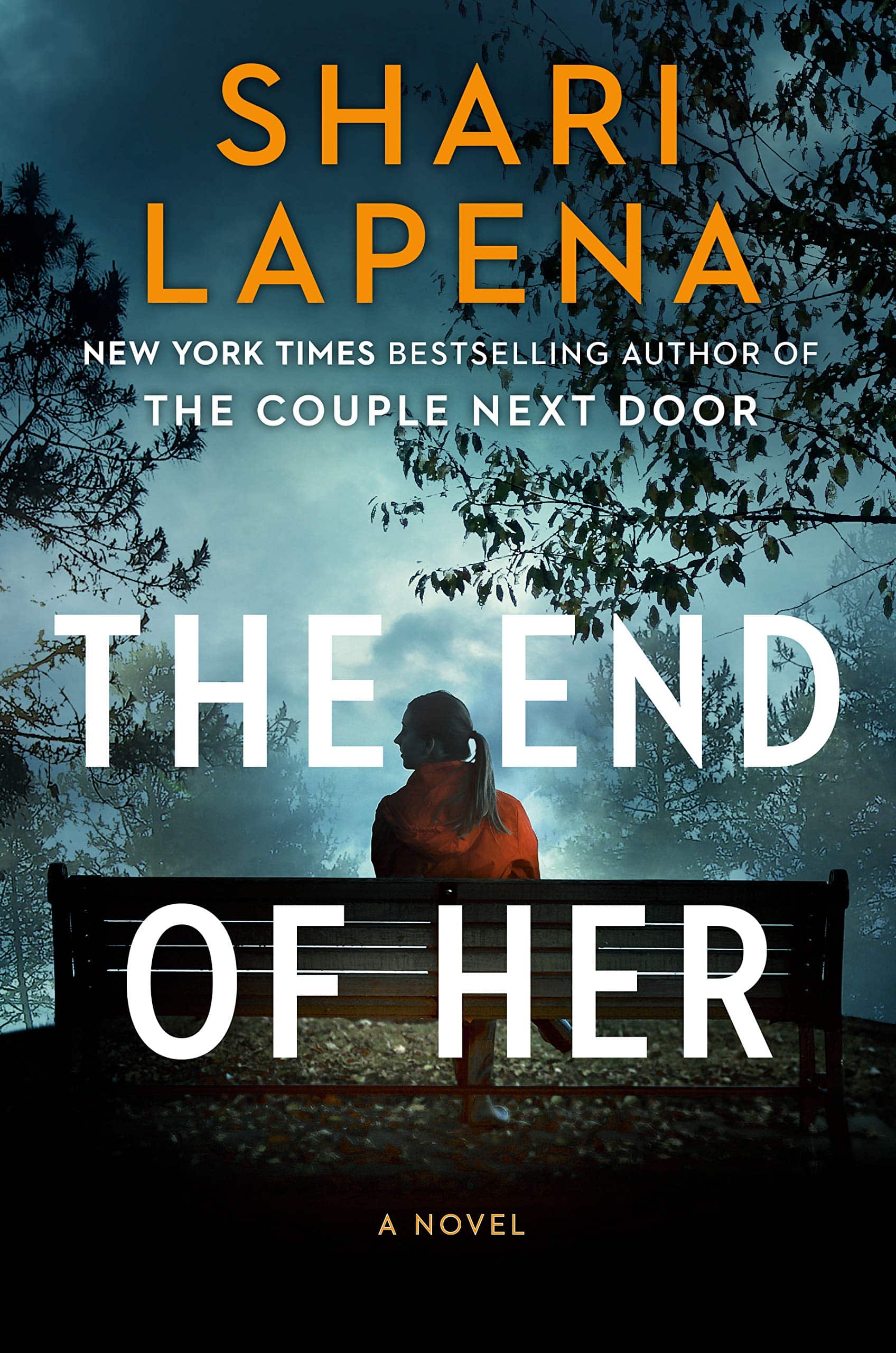
Finally, here’s the cover of The End of Her. I really like the woods; they give me a feel for the environment where the hero lives.
So now I’d done all my research. What kind of cover should I suggest for The Necklace?
I surprised myself. I decided it wasn’t so important to see the main character on the cover. I admired the cover of The Wife, with the big picture of the ring in a place where it didn’t belong.
I also liked the atmosphere of The End of Her.
So I decided what I wanted for the cover of The Necklace was a picture of the necklace in a place where it didn’t belong. Since much of the novel, including the murder, takes place in the Adirondack woods, I thought: let’s put this cute plastic beaded necklace in the middle of a dark forest.
That’s what I suggested to Oceanview. I waited for a month to see what Oceanview would come up with. I tried not to have high hopes, and just accept that I had done what I could.
Then one morning I opened up my email. Oceanview had sent me a photo of the cover, as designed by the graphic artist Christian Storm. Here it is:
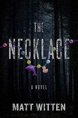
I couldn’t believe it. They had taken my glimmer of an idea and improved it, making it better than anything I could have dreamed of. Their idea to have the necklace hanging down from the letters of the title works perfectly. The cover perfectly encapsulates the tone of the novel, which combines scariness and innocence. The forest evokes the Adirondacks. Basically, this cover is not only striking, it also tells the reader what they’re going to get if they decide to open the book up and start in. I have no idea how The Necklace will sell when it comes out next month, but I know one thing: this cover won’t hurt.
Actually, I know one other thing too: It’s a really, really good idea for publishing companies and authors to collaborate on their covers. I highly recommend this process to all.
About the Author
Matt Witten is a TV writer, novelist, playwright and screenwriter who has been writing for television for the past twenty years, including such shows as House, Pretty Little Liars, Law & Order, CSI: Miami, Medium, JAG, and more. He has written four mystery novels that were published by Signet. His latest is The Necklace.

More Psychological Thriller Features
Psychological Manipulation in Thrillers
Memory, Identity, and Madness
The Dark Side of the Mind
The darkest corners of the mind are not just settings but essential characters
Suspense Weapons
Unconventional Weapons in Suspense Fiction
Advertisement


